Why do some online stores make you click “buy” instantly while others don’t?
You’ve been there. Scrolling late at night. One store feels smooth. Clear. Almost inviting you to click “add to cart.” Another? Messy. Slow. Confusing. You don’t think twice. You leave.
What’s the difference? It’s not luck. It’s not a chance. It’s the art of visual conversion. The way design pushes you—quietly but firmly—towards action.
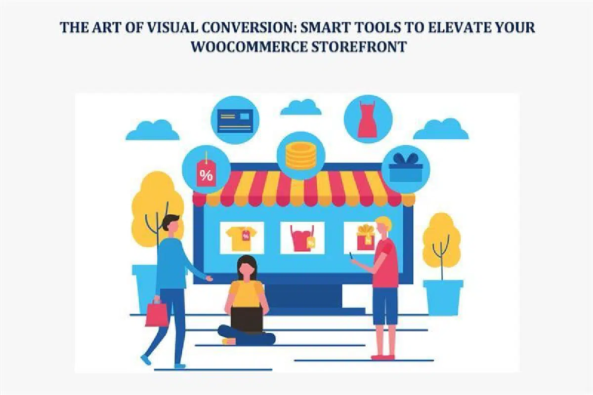
In WooCommerce, this is gold. You can sell with images. With colors. With layouts that whisper: trust us, buy now. And the truth? People rarely think about it. But they feel it. That’s what we’re diving into—how to elevate your WooCommerce storefront with smart tools and sharper visuals.
Psychology of Visual Conversion
Humans think in pictures. Before words. Before logic. A website? It’s judged in 50 milliseconds. That’s it—half a blink.
Colors control emotions. Blue—trust. Red—urgency. Green—growth, maybe eco vibes. Fonts do the same. Serif says “tradition.” Sans-serif? Clean. Modern. Even white space matters. Too little, it’s chaos. Too much, it feels empty. Balance is king.
It’s a quiet language. Not taught in school. Yet everyone feels it. WooCommerce gives the base. But you? You decide how people feel when they land on your store. Excited. Confused. Curious. Or ready to click “buy.”
First Hook: Product Images
Let’s be honest. Nobody buys off blurry pics. Would you? Of course not.
Good images sell trust. They prove quality before a single word is read. But one photo? Flat. Boring. Customers want to see it all. Angles. Close-ups. Lifestyle shots. It could be a 360 spin, like holding it in your hands.
Smart tools make this easy. Plugins like WooThumbs for WooCommerce or Magic Zoom Plus add zoom, multiple views, and video integration. You don’t just show a product—you show an experience. And that, right there, pushes hesitation away.
Story in Motion: Product Videos
If pictures grab attention, videos seal the deal. They sell a story. Movement, sound, emotion—it feels alive.
Statistics? Videos can boost conversions by 80%. That’s not fluff. It’s human nature. We trust what we can see in action.
In WooCommerce, add a video with plugins like WooCommerce Product Video or simple YouTube embeds—a dress flowing on a model. A blender is actually blending—a chair in a living room. Words can’t match that. Videos reduce doubt. They replace “I wonder” with “I need this.”
Layouts That Guide, Not Confuse
Ever land in a store that feels like a maze? Too many banners. Tiny buttons. No flow. You leave. Fast.
Smart layouts do the opposite. They guide. They lead you step by step. WooCommerce pairs beautifully with builders like Elementor or Divi. Drag. Drop. Shape your store.
Hero banners for bold offers. Product grids that look perfect on any device. Clean typography. White space in the right places.
Think of your layout like a road. Smooth, simple, clear signs. No traffic jams. No dead ends. That’s conversion.
Interactive Magic: Keep Them Hooked
Engagement matters. The longer someone stays, the higher the chance they buy.
So? Give them something to play with. 360-degree viewers. Augmented reality previews. Product customizers for colors, engravings, and tweaks.
Tools like Zakeke or WooCommerce Custom Product Designer make it real. A customer doesn’t just imagine. They see. They interact. Doubt fades. Confidence grows. And clicks turn into checkouts.
Silent Player: Typography
Fonts are sneaky. They work in the background. But wow—they can make or break trust.
Hard-to-read text? Cheap vibes. Clear fonts? Instant authority. Please keep it clean. Bold headings. Legible body text. No strain.
WooCommerce lets you integrate fonts easily with Google Fonts. Align them with your brand voice.
And here’s where WooCommerce Loop Description shines. It keeps product descriptions inside category loops neat, consistent, and readable. No clutter. Just enough to tease. Enough to make a shopper click through.
Directing Eyes with Visual Hierarchy
Think of design like storytelling. First, the headline. Then, the details. Then, the action. That’s visual hierarchy.
Big bold titles grab. Subheadings explain. Images prove. Buttons close. Done.
Psychology kicks in. People’s eyes follow a pattern—left to right, top to bottom. Place CTAs in the path. Make them pop with color. Add urgency: “Only 3 left.” Scarcity sells.
Plugins like Beeketing for WooCommerce pump this up with timers, sticky carts, and sale badges. Small nudges. Big results.
Trust Made Visible: Social Proof
Even with a sleek design, buyers hesitate. They ask—who else bought this? Was it worth it?
That’s where visual proof wins. Reviews with photos. Star ratings near titles. Video testimonials. Real people, real experiences.
Plugins like TrustPulse or Photo Reviews for WooCommerce display them beautifully. When new visitors see happy buyers, hesitation melts. They think— “Okay, safe to buy.” That’s trust. That’s conversion fuel.
Mobile: The Real Battleground
Here’s the truth. More than half of shoppers are on phones. That tiny screen is where battles are won or lost.
Mobile optimization is not shrinking your site. It’s rethinking it. Buttons must be thumb-friendly. Fonts legible. Images compressed but crisp. Fast loading—because slow kills sales.
Tools like AMP for WooCommerce or WP Rocket help with speed and responsiveness. Combine that with lazy loading, and your visuals pop instantly. No lag. No friction. Shoppers stay.
Testing. Tweaking. Winning.
You can’t just guess. You test. You measure. You learn.
Does red outperform green on buttons? Do reviews above the fold work better than below? Only testing shows the truth.
Tools like Google Optimize, Hotjar, and OptinMonster give you heatmaps, split tests, and session replays. You see where eyes go, where clicks happen, where they drop off.
Then you adjust. Small tweaks. Big gains. It’s a cycle—design, test, refine. Over and over.
Branding: The Glue Behind Visuals
Branding isn’t just a logo. It’s the soul of your visuals. It’s consistency across every page.
Colors that repeat. Fonts that stay the same. Photography with a clear style. That’s branding. It builds memory. Recognition. Trust.
WooCommerce stores can use brand kits or plugins to maintain uniformity. Shoppers shouldn’t feel like they’re jumping to a different site when moving from the product page to checkout.
Luxury brands keep it minimal. Eco brands keep it earthy. Whatever your niche, let visuals echo your story.
Future: Beyond Static Screens
Visual commerce is changing. Fast.
AR lets shoppers drop furniture into their living rooms. VR will soon let them “walk” through a 3D store. AI already personalizes visuals—showing products based on behavior.
Imagine banners shifting depending on who’s watching. Or product recommendations changing image styles based on past clicks. That’s not science fiction. It’s the near future. WooCommerce is adapting, and if you ride the wave early, you win.
Conclusion
The pretty design is nice. But pretty doesn’t always sell. Conversion-focused design does.
Your WooCommerce storefront should guide. Should flow. Should tell a story with visuals that whisper “buy.” Not scream. Whisper. Subtle, but powerful.
Use the tools—sharp images, strong videos, interactive elements, clean typography, mobile readiness, and social proof. Test them. Refine them. Wrap it all with branding that feels consistent and true.
In the end, design isn’t decoration. It’s persuasion. It’s trust. It’s a conversion. And once you master the art of visuals, your WooCommerce store won’t just look good. It’ll sell better.